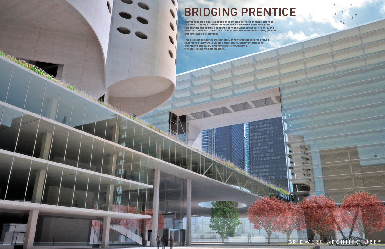
We are proud to announce that our partner firm, Gridwerk Architecture has won 3rd place in the 2012 Chicago Prize Competition: Future Prentice.


click image to view larger

The Chicago Prize Competition occurs every other year and is an open, single stage, international competition run by the Chicago Architectural Club with the Chicago chapter of the American Institute of Architects. This year there were 71 entries from 13 different countries. This years challenge, Future Prentice, was to study Bertrand Goldberg’s Prentice Women’s Hospital and explore solutions for the historic site that set the stage for modern hospital design, even today.

The team was led by James Wild, founder and principal of our partner firm Gridwerk Architecture, with Ashley Wendela and Andres Lemus. Overall rendering by Saman Moayer. Presentation layout and entourage by Lauren Haras and Katelyn Smith. Additional support by Katherine Lee, Pedro Melis, Kerry Rutz, Tom Marquardt and marquardt+.


click image to view larger

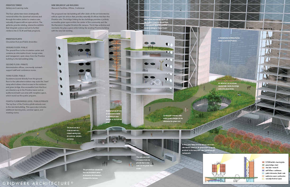
Gridwerk’s design strategy looks to preserve Prentice as a center for community education with learning labs and science focused galleries, while creating a state-of-the-art laboratory research center connected by an open green roof ‘park’, accessible to the surrounding community, in the center of the NW campus.

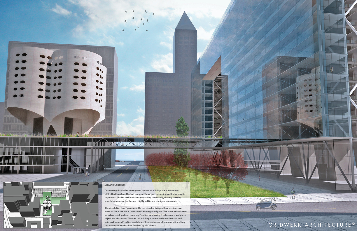
Prentice and the adjoining site are ideal for promoting the Science, Technology, Engineering and Mathematics Education Coalition (STEM), which promotes the pursuit of careers in the sciences and technology.

The new, state of the art 500,000 sf lab building houses research labs and offices for NW, and supports the community with a needed public green space and knowledge resource center.


click image to view larger

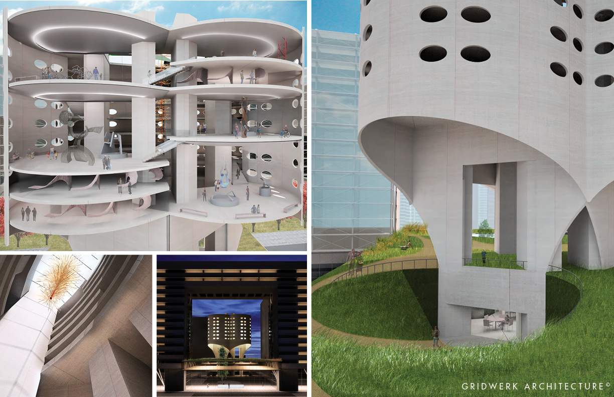
A subtractive design approach was taken with the existing Prentice structure. Removal of floorplates opens the volumes and creates a large central atrium to connect programs, allow natural light, and create an open terrace garden. These moves celebrate the sculptural qualities of the building and create a sequence of slow ascent.

The top level of the existing plinth is transformed into an elevated public street and park that provides the community with a much needed green space and respite to NW patients and staff, while creating an intimate relationship between Prentice and the community.

Nestled between the lake and Michigan Avenue, and adjacent to public thoroughfares, the site is often overlooked. This new program and design strategy makes Prentice and the new plaza a destination for the world and provides NW a visible signal of health, wellness and community.


click image to view larger

Read More

Did you know that Tom has also written magazine articles? Here is one for the Journal of Light Construction detailing the design process of updating a cramped, maze-like shotgun apartment into a modern, airy flat.

To see the whole article download the pdf. For more information on the Chicago Shotgun Flat design and renovation, please see our case study.

Read More

marquardt+ developed a complete interior and exterior brand overlay presentation system for 11 of Tetra Pak’s North American facilities, as part of the implementation of their new international rebranding strategy. New elements included approved interpretations of the new Tetra Pak logo, messaging and packaging displays in environmental graphics, wall treatments, landscape design, flooring lighting, painting and furniture strategies and intranet information portals. The initial implementation shown has been implemented to their Denton, TX facility and portions of the Vernon Hills, IL US Headquarters.

Tetra Pak also asked m+ for help with a Green Information Portal. This was an area in each facility that could work like a bulletin board for all things sustainable, and encouraged everyone of any level to engage in the process of making the company greener.


See more of the brand overlay and the green information portal at our website!

* work performed as Design Collaboratives

Read More

Quick! Before it ships to Manhattan to be installed in the fabulous Maya Romanoff New York Showroom, here is a sneak peek at the corridor identity/display signage column – designed by marquardt+. It is custom-formed metal with stand off metal letterforms backlit over Romanoff Bedazzled Geode Flexible Glass Bead Wallcovering in “Scotch N Soda”.

The face of the column is designed so that Romanoff can periodically recover the surface in other products, updating the sign with new product introductions, colors and/or styles. This creates a flexible hallway product display unit out of what is normally just an identity sign. Illumination comes from newly released Environmental Lighting Dimmable LED Side View Strips (Soft White). This is LED tape that actually edge lights off the edge of the tape, not the face like typical LED tape lights, so it is perfect for dimensional letterforms and other tight lighting conditions traditionally un-lightable!

See more of the showroom on our website!

Read More


The most sought after SECRET pop up dinner event is officially launching in Chicago on August 24th, with the help of Gridwerk Architecture’s James Wild and m+’s own Lauren Haras. We know it is a bit confusing with another event called Chicago in White happening close to our date, but rest assured that our event is the official Dîner en Blanc Chicago based on the original Paris event. Please read our Press Release for more information!

Dîner en Blanc and Dîner en Blanc International Inc. has grown to include 24 host cities globally. This year, Chicago is pleased to join these prestigious ranks by officially launching this celebrated event in affiliation with the original Dîner en Blanc International and will run in accordance with the high standards put forth by the Dîner en Blanc International Inc. trademark.

In true Dîner en Blanc style, participants will be asked to bring their own tables, chairs, food and drinks. As an added treat, world-renowned Chef Tony Mantuano of Spiaggia will be creating gourmet picnic baskets that may be purchased in advance for the event. In short, a group of 1,000 attendees will have a memorable evening in the heart of Chicago, relaxing with a glass of wine, friends, dinner, dancing and music!


Read More

For NeoCon 2012, CF Stinson again hired marquardt+ to provide design updates to the Merchandise Mart showroom and apply their new brand logo to the space. In addition to being responsible for updating the product signage, designing new product line signage, and creating a new logo application on the glass storefront, m+ also designed a temporary display to promote the new Michael Graves collection. This included a mounted poster at the store front and a storage display for a Michael Graves designed poster that was both functional and elegant.

Additional 2012 work included a printed NeoCon invitation for their cocktail party and Michael Graves poster signing, digital invitation and digital reminder based on their new print advertising.


See the rest of the showroom at our website!

Photography by Jaysen Goranson

Read More

marquardt+ was very excited to take part in this year’s Chefs’ Night Out, sponsored by CS Interiors. Each year, a number of restaurants and design firms are partnered to come up with a special food to present at the event. Tom met with Chef Jack Funderburg and his team from Prasino, and we decided to go for unabashed self promotion, and did a joint branding exercise, right down to the food design, as well as presentation.

Utilizing plexi squares we had in storage left over from a project, we laminated the backs in three tones of gold to green, hitting both our and Prasino’s brand colors and the tone in between. We also made square wood legs, based on the materiality of their restaurant.

We also utilized the concept of the image collage they have applied to their recessed booth seating, incorporating images of the m+ family and projects with their images of the Prasino family, restaurants and food. We layered this with a co-branded logo of marquardt+ Prasino to top off the total design/brand concept of this temporary installation within the Consentino Showroom at our assigned location.

The idea we developed and Chef Jack and team executed is a butter poached scallop with micro cilantro, nori wafer in a ponzu sauce. The presentation is a combination of both our logos: the wafer is the marquardt+ logo strike, and the scallop and micro cilantro is the logo “o”. The simple flat spoons provided style and easy enjoyment for our guests who didn’t have to juggle their drinks with plates or forks to devour our serving.

We didn’t win, but we did get rock star attention and a lot of happy and surprised faces when they experienced the food. We look forward to future collaboration with Prasino!

Read More