archive
our work

While working with Okamura to update their showroom for NeoCon 2012, the need arose for art in the ‘conference room vignette’. Some within Okamura wanted to incorporate art that was comparable to what is normally seen in a corporate setting, while others wanted to use the space to show off more of their beautiful product photography, like what we used to create the macro graphics throughout the showroom. NeoCon was fast approaching, and because Okamura had many other things to prepare for the show, the decision of what the art would be was left to m+ (muahahaha!)

After a brief in-house meeting, it was quickly decided; let’s do both! Okamura’s upscale office furniture is so beautiful, it is art in and of itself. We printed out the photography that we had to work with and started folding the paper to see what other interesting forms we could create while accentuating the subtle beauty in the detail of Okamura’s product. Once we had a plan for each of the 6 images we wanted to create, it was taken back to the computer to become a reality.

Each image takes the photograph of one chair and either repeats or mirrors it to construct hypnotic and surreal works of art. The final images were printed in our studio and taken to the Frame Factory to be properly mounted and framed. We were able to deliver them to the showroom the day before NeoCon, and unveiled our creations in front of a dozen Okamura decision makers and employees from around the globe. As soon as the craft paper wrapping came off, the cell phones and cameras came out! We don’t know what they were saying, exactly, but we know it was good!

See the whole series, as well as the lovely framing details at our website!
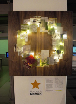
Read More

Not only do we create environments, we also custom design products to go in them. We are not afraid of a little industrial and product design! Just added to our website is our product section. Check back often for updates, because almost every environment we have ever designed includes custom furniture, storage, and more! Below is a little teaser of what has been added.


custom chandelier for Maya Romanoff New York


custom identity pillows for ESI Ergonomic Solutions Inc


LED lighting fixture concepts for Artemide

   
custom counter stools for CF Stinson

So head over to the product section to see everything new we’ve added, including the wreath and menorah we featured on the blog previously!

Read More

Our lovely wreath, S. Fernando, won Honorable Mention last night at Steelcase’s Wreath and Menorah Charity Auction! We’re number two!

In all seriousness, the creation did manage to raise $330 for The Children’s Place Association, and our beautiful scientific menorah raised $130!


We had a great time at the event and can’t wait for next year! Tom and Lauren even won raffle prizes!


And for a little extra Christmas cheer [and for those who didn’t get the joke]:

Read More

It was hard for us to decide whether we wanted to create a wreath or a menorah for this year’s 13th Annual Steelcase Wreath and Menorah Charity Auction, so we decided to design both! Each design is unique and offers a completely different aesthetic.

For the wreath, we utilized off-cuts of acrylic samples graciously donated by 3form. Christmas colors are layered to create a mid-century modern wreath, pin-mounted to a beautiful walnut panel, which was donated by Greatlakes Architectural Millworks. Working together, the materials make a fun, colorful wreath that harkens back to a classic wreath, but with a modern twist! The name, S. Fernando, is a reference to the mid-century modern movement that was so prevalent in the San Fernando Valley.

For the menorah, we wanted an elegant yet slightly quirky design that utilizes olive oil lamps, like the original menorah. Our creation is made from test tubes, an Erlenmeyer flask, and a simple bent steel plate, which was welded by our own Andres Lemus.


Check out the website for more images and process of the wreath and menorah!

Read More

Did you know that Tom has also written magazine articles? Here is one for the Journal of Light Construction detailing the design process of updating a cramped, maze-like shotgun apartment into a modern, airy flat.

To see the whole article download the pdf. For more information on the Chicago Shotgun Flat design and renovation, please see our case study.

Read More

marquardt+ developed a complete interior and exterior brand overlay presentation system for 11 of Tetra Pak’s North American facilities, as part of the implementation of their new international rebranding strategy. New elements included approved interpretations of the new Tetra Pak logo, messaging and packaging displays in environmental graphics, wall treatments, landscape design, flooring lighting, painting and furniture strategies and intranet information portals. The initial implementation shown has been implemented to their Denton, TX facility and portions of the Vernon Hills, IL US Headquarters.

Tetra Pak also asked m+ for help with a Green Information Portal. This was an area in each facility that could work like a bulletin board for all things sustainable, and encouraged everyone of any level to engage in the process of making the company greener.


See more of the brand overlay and the green information portal at our website!

* work performed as Design Collaboratives

Read More

Quick! Before it ships to Manhattan to be installed in the fabulous Maya Romanoff New York Showroom, here is a sneak peek at the corridor identity/display signage column – designed by marquardt+. It is custom-formed metal with stand off metal letterforms backlit over Romanoff Bedazzled Geode Flexible Glass Bead Wallcovering in “Scotch N Soda”.

The face of the column is designed so that Romanoff can periodically recover the surface in other products, updating the sign with new product introductions, colors and/or styles. This creates a flexible hallway product display unit out of what is normally just an identity sign. Illumination comes from newly released Environmental Lighting Dimmable LED Side View Strips (Soft White). This is LED tape that actually edge lights off the edge of the tape, not the face like typical LED tape lights, so it is perfect for dimensional letterforms and other tight lighting conditions traditionally un-lightable!

See more of the showroom on our website!

Read More