February 7, 2022
The Old Guard and The New Decency – The Fine Line between the Advertorial and the Critique
Since January, I have been slowly working on three separate blog postings. One is advertorial and two others critiques.
Like anyone working thru the writing process I am continuously gauging how candid and how restrained to be and yet communicate clearly. We navigate a minefield when writing an opinion or marketing for business, especially as a design professional leading a practice, and not a writer first.

Apparently this is where mindfulness, ethics, quality and quantity are supposed to intersect in our considerations…or at least I hope they do.
What do we provide to make a point and be understood?
Our practice advises our clients on these challenges all the time. Yet when it comes to writing and speaking for ourselves on business or practice of design, how far do we go, or should go?
So I decided to write an article ABOUT these blog articles and the challenges of writing adverts and critiques, and why we even bother to express ourselves in the first place. And a warning that this article is at least a 10 minute read!
As Thumper supposedly once said: If you can’t say something nice, don’t say nothin at all.
Creating advertorials
Despite our website presentation, case studies and 35 years of successful project work most new audiences are unfamiliar with our unique practice or interdisciplinary design as a specialty. They do not readily understand that everything a business client needs from a strategy agency or design studio can be addressed by one practice holistically and efficiently with all the required expertise.
Most businesses work with an array specialized organizations to address each individual project they have and accept the increased costs, coordination, fragmentation and disconnect that can come with this approach.
So to be more effective and better understood we are creating simple adverts that focus on each individual services we provide versus the wide spectrum we can deliver. These ads will include a graphic summary image and link to a short blog post with a concise description and call to action. Done.
For me, attempting to communicate these complexities in a sound bite is an interesti ng challenge in self restraint.
How do I not elaborate on how one interdisciplinary agency can address business, marketing and brand strategies AND all the deliverables that result from that work PLUS provide interior design, product display and full branded environments? Maybe all they want is a new office!
So I try not to. At least not right away. And few potential clients want to be hit in the face by a firehose from the get go!
You see, I do not recognize that the boundaries of specialization are always effective or necessary even for a specific project type.
And sometimes these boundaries become a detriment to success because they do not connect to other company outfacing experiences.
And so it follows that I have a habit of writing, speaking and detailing my ideas profusely and redundantly. Like right here in this post. All to make a point and more so, to be clearly understood. And not always in tightly edited and advertorial ways.
And fortunately this is also why we have strategists and writers who can do just that. Both for me and more importantly, for our clients.
Yes, I have learned over the years to listen more, self edit and work to keep my enthusiasm laser focused. But as any of our long term client can attest there are those moments where I will just go off and well, help our clients see the forest AND the trees AND the spaces inbetween.
I may over elaborate, but by doing so I will help connect the dots for them. I earnestly want to take them beyond their expectations with our work and their outcomes.
I mean, they keep coming back, right?
Criticism of another design cliché
On one hand I feel it is my obligation to express concern when I observe small but glaring design traps that can reflect poorly on solution making. On the other hand I know some may get upset by my pointing these out.
Yet my professional observations, like the feedback I provide when teaching design studios are for just that; to highlight concerns that help everyone avoid future pitfalls and raise design awareness, standards and expectations.
Even with the most insignificant of observations I do my best to channel Cheryl Durst, the executive vice president and CEO of the International Interior Design Association (IIDA). Cheryl has the knack to express exactly what she believes but in ways that inspire awe, respect, introspection, decorum. And she does so with a clear and deliberate intent and decisive confidence.
She is one of my most influential role models when it comes to writing anything involving opinions, initiatives, thinking and practice and whom I fear the most reads my writing and cringes.
So let me see if I can make Cheryl cringe:
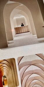
The repetitive applications of gratuitously applied faux round topped archways have been appearing again and again in all sorts of interior design projects. And they appear regardless of style, type or context.
These classic archways are all over the design press. I just saw a full height round archway niche designed into a set backdrop on the Ellen talk show set last week.
This set me off to start writing a blog commentary about this observation. I am seriously waiting to see if Home Depot or other big box hardware stores start selling prefabricated full height interior archways in a box branded with a DYI network celebrity.
It is like watching the unique cut and style of a spring couture collection being reinterpreted over and over until the following spring it is all the rage at the Dress Barn. Here is Arch Daily themselves perpetuating that journey, profiling 26 applications of the arches: Arch Daily feature on Arches in interiors
While I have not made any effort to determine who actually started this current fad I do believe it was the Romans who first started using them everywhere. The archway trend certainly fills hundreds of recent Pinterest accounts about interior design and is still being applied to high profile projects around the world.
Now, considering that many well executed spaces look stunning regardless of what defines a design trend at any given moment I will admit that these trends can be applied in beautiful and unexpected ways. 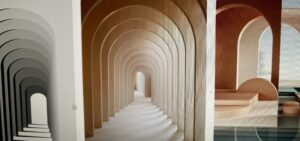
Yet, after seeing 30 or 40 similar solutions pop up in a great number of design press published projects over a short period of time and the whole thing starts to feel like an uninspired crutch.
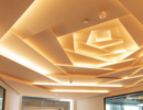
Got an empty hallway? Add a potted ficus tree, or maybe a series of archways!
Having worked in leadership roles at large corporate practices I suspect these applications occur as the result of interior designers lacking the billable hours to invent something new and are dependent on their personal taste captured on Pinterest accounts and justified by their redundancy from other respected sources.
Or they just lack the energy or wherewithal to address a design challenge with truly new ideas that respond to client and context and not other designers work.
And honestly many clients task interior designers with making their projects feel fashionable and up to date, and ask for such details after seeing them in the same publications themselves. Archways become the latest agreed upon visual cue to express design. And even if using them dates the interiors and will be ripped out within a few years to be updated with the next fleeting fad.
This is why some designers can identify the period an interior space was designed almost to the year, almost like the cut of a dress.
Yet with the demands for a heightened awareness and focus in interior design on occupant wellness and sustainability, greater brand differentiation, adaptive, flexible and resilient functionality and more equitable human inclusion I find the lack of creative effort shown by embracing such clichés strangely ironic. Are we really willing to continue to use disposable fashion as a problem solving applique in interior design? (Stage and TV set design notwithstanding.)
This doesn’t bode well for our profession, especially in commercial and corporate practice with multiple interior design associations working so hard to elevate and unify our expertise and the value of interior design thru stringent education standards, licensing exams and qualification requirements, and government legislation.
Now my message here is not to say completely ignore all current trends. I just hope by highlighting this small observation we all stop, take a step back and think, and then push our design solutions to create new ways of thinking about what reflects our individual clients, their unique experiences, brands, people, challenges and contexts.
Doing so does not negate creativity or integrating inspired style and fashion into all our work. It just redefines how infinitely more creative a project could become when inspired by the context of all that we are tasked to address in a project in a way that we deliver so much more value to our clients and their projects for years to come instead of for the moment.
I believe this eliminates my need to write a separate blog post so let me just move on!
Advertorial for L’Autre Image leads to criticism
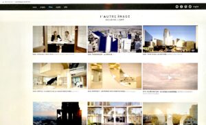
Speaking of elevating the practice of design, the third blog was to be a short critique to highlight the work of L’Autre Image. I have used their work as examples for my students, consultants and employees to highlight how to apply restrained, emotional visual storytelling in visual design presentations. There is a link above in the title to their website and work, and especially their sensitively designed video productions with strategically scored custom soundtracks that do nothing but enhance these emotive design presentations.
If we ever had a client interested in investing in extensive video work as part of our solutions we definitely are keeping L’Autre Image on our consultant list to consider retaining with total confidence. They are so talented at referencing the experiences and context of the built environment and using visual and audio technologies to do so WITHOUT being super realistic. It is no wonder major practices use them to activate their project entries for major competitions and presentations.
Pushing boundaries while riding the line
During my review of the L’Autre Image portfolio for the post I discovered a promotional video on their site: 2017. TOUR MONTPARNASSE – PARIS. architecturestudio ArchitectureStudio’s unrealized design entry for the 2017 design competition to renovate the Tour Montparnasse in Paris.
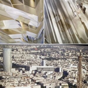
The original tower was designed by architects Eugène Beaudouin, Urbain Cassan, and Louis Hoym de Marien completed in 1973. The building was so hated by Parisians that two years after completion the city of Paris banned construction of any building over 7 stories in the city center.
Since I was working on my own critique I decided to attempt to locate reviews of the winning competition entry and see how the design press went about critiquing the selected solution.
And what a discovery I found! And it is certainly NOT advertorial.
Below is the link to an exceptionally detailed, crisp and frank op-ed written by Graham McKay on his website Misfits’ Architecture. He reviews many of the entries and the final winner. He is so on point and this is definitely an educational yet highly entertaining read. I laughed out loud more than once and will be curious to know if others do as well. The link is in the image title and a little sketchy, so right click it, or you may just have to do a search for it but it will be worth the time:
Reading this exceptionally candid review reminded me how sorely we lack honest criticism in the design press, and especially about interior design. At least not any that really challenges the status quo without being advertorial with the exception more obscure social media sources and the likes of Graham McKay and his website.
Thinking about this deficiency brought new meaning to the title The Old Guard and the New Decency and reminded me of what I consider the gold standard for reviews and criticism in the design and architectural press, from the past.
The Architectural Review – Peter Davey + Peter Buchanan
 I had the great fortune in the late 198os to meet with and discuss the advertorial and the critique with the late Peter Davey and Peter Buchanan, editor, and lead writer respectively for The Architectural Review in London, at the Bride of Denmark pub owned by the magazine at the time in the basement of their former Queen Anne’s Gate offices.
It was a rare opportunity for me to engage these two journalists whom I had followed for the years leading up to this lunch. We were introduced by my British colleague Andrea Brown who arranged our meeting due to my love of their publication and work.
At first I found it really awkward. They initially seemed SO culturally elitist, aloof and a little dismissive of this scared young unknown American designer from Chicago, apparently forced upon them by our mutual friend.
But as we struggled on they started to warm up and be more candid. I began to understand their tone, writing, confidence and influence and they my decidedly American enthusiasm for their work and points of view.
As a result we spent almost three hours discussing our respective work, their position on design criticism, the growing advertorial approach of other design and architectural journals. They shared what is was like for them to have been practitioners who also taught and then became journalists.
They revealed their personal design viewpoints, and observations on the evolving nature of design, in the context of 1980s popular culture and the beginning of the deconstruction of journalism as a profession at the time. Peter Davey profile
The experience confirmed my affinity for their unabashed critical observations and approach. It also validated my need to cultivate my own voice and build confidence in myself, my work and my ideas. I honestly believe they were a force like few others at the time and executed their reviews with unflinching honesty regardless of the project, the practice or the blowback.
And blowback there was.
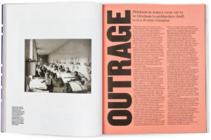
The AR team found themselves challenged by both their publishers internally and by lawsuits externally on a regular basis. This was especially true from their short lived but wonderfully entertaining one page bookend features Outrage, which profiled the worst of design and architecture in the most unedited and direct honesty possible, and Delight which simply relished the most unexpected, obscure yet charming design moments from around the world.
The point
As much as I have experienced over the years I am continually amazed and challenged by how the voices of design are evolving. I think this reflects my continued willingness (sometimes begrudgingly) to stay open and speak my mind.
We need more voices of reason and honesty like those above today more than ever. Not only to help our industry evolve as a more transparent, responsible and self aware profession, but also to unify and lift all of us and thus the value of design itself.
I will continue to work on being more direct, honest and candid and by doing so honor those who take much bigger risks in practice, business and life to maintain their integrity and express their views.
It is the only way to truly nurture design excellence and help create a much better world. Now if only I could edit more effectively.

Tom!