CASE STUDY

basyx™ Office Furniture

m+ services provided

Brand Strategy and Development
Marketing Strategy and Development
Identity/Logo Design and Development
Brand Standards Design and Development
Brand Photography Standards
Product Photography Standards
Photoshoot Art Direction
Graphic Design
Print and Digital Collateral
Print Advertisements
Product Brochures
Product Binder Design
Product Marketing
Copywriting
Advertising Strategy
Advertising Copywriting
Sales Training Presentations
Website Design 
Showroom Design
Exhibit Design
Environmental Graphics
Branded Environments
Product Display

Logo & business stationery

description

The basyx brand strategy development package and application roll-out was created and executed by marquardt+ (work performed as Design Collaboratives) to establish the basyx product division for the HON Company (HNI Industries). The company was looking for a solution to foreign furniture manufacturers that were increasingly taking market share from the HON Company in the entry level furniture market segment.

The HON company decided to re-issue selected existing HON entry level furniture products while adding newly designed pieces to create a complete entry level office furniture line. The intent was to take this new line and create a brand identity separate of the HON company to compete directly against other entry level products. The foreign manufacturers were exporting products to the US at extremely low price points and selling well due to pricing, despite having incomplete lines, substandard products, and inconsistent customer support.

Typical entry level contract furniture end users are start-ups and entrepreneurs who are furnishing or upgrading their first small office spaces, looking for a consistent full line offering of products from one source that is easily accessible, available, and expandable. The HON company realized they could capture more of this market by providing better quality design and detailing supported through the dependable HON national customer service and distribution network already in place. As award winning experts in lean manufacturing, HON knew that if developed and manufactured properly, they could maintain extremely competitive price points.

As a result the initial brand strategy called for marquardt+ (m+) to create and differentiate this new line from other entry level contract office furniture lines.

As most of their foreign competitors had little to no brand equity or unique identity, m+ set a goal to create a tight and instantly recognizable brand. m+ determined the solution should position this furniture line as being simple to access for first time buyers with no prior contract furniture purchasing experience. Options, finishes and materials would be pre-selected with limited options to provide easy decision-making and product coordination. We also encouraged the client to embrace and bandstand their competitive pricing, allowing the brand to clearly showcase the product for what it is: inexpensive and quickly available entry level product that has quality and value for the price. This differentiated basyx from competitors’ brands that consistently position products as being more upscale than they actually are. The HON entry level product line was developed to be simple, clear, easy, and “basic”, and so would be the brand.

From the name as inspiration, m+ created product information and presentations that felt more retail, capturing a more familiar process for first time specifiers and end users. This approach also helped streamline the amount of time and dealer involvement needed to select, specify, and order. In addition, we convinced the client to present large list prices tagged on products displayed at tradeshows, contract, and office dealer showrooms, an unheard of practice in the contract furniture industry. These moves as well as other attributes of the basyx brand rollouts would help make basyx more desirable by dealers, not wanting to spend a lot of time on this type of sale, or have to resolve problems they were accustomed to with other entry level products.

Digital ordering module

Catalogs & model photography

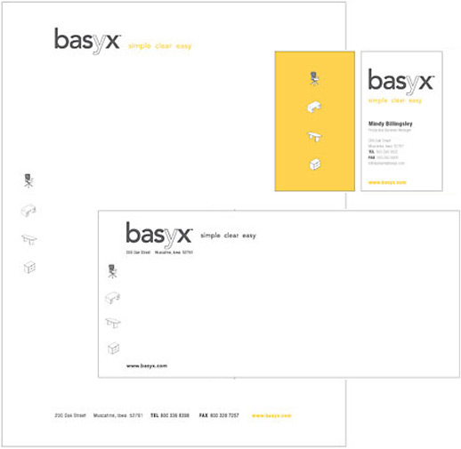
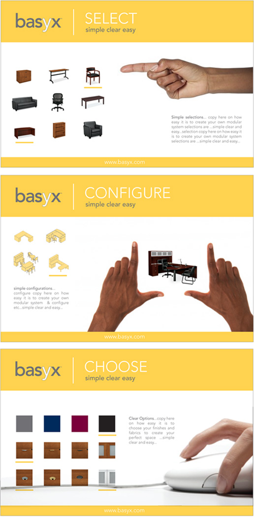
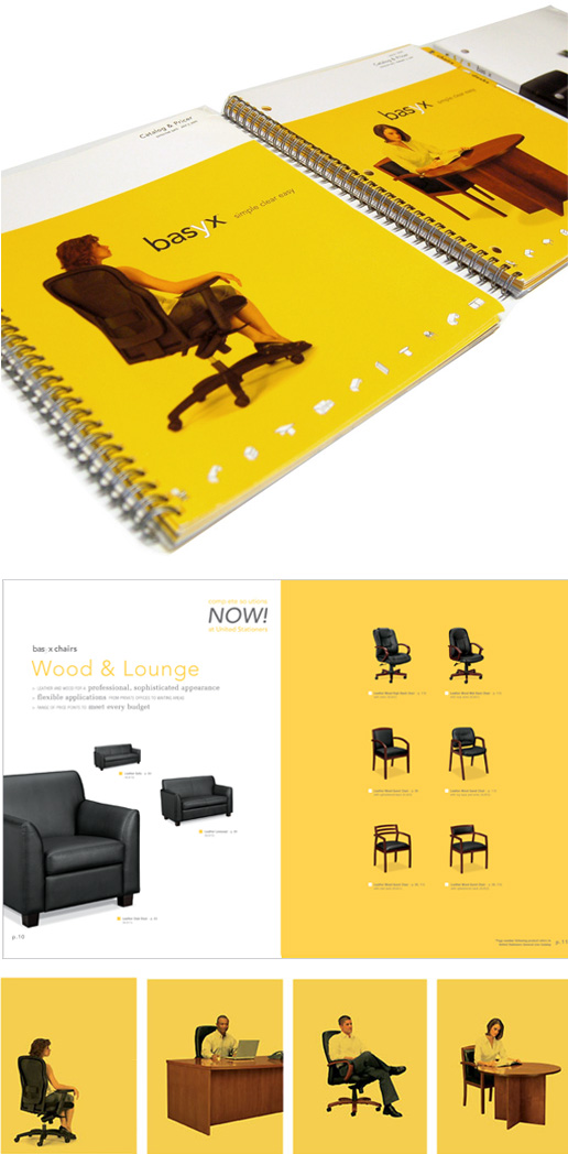
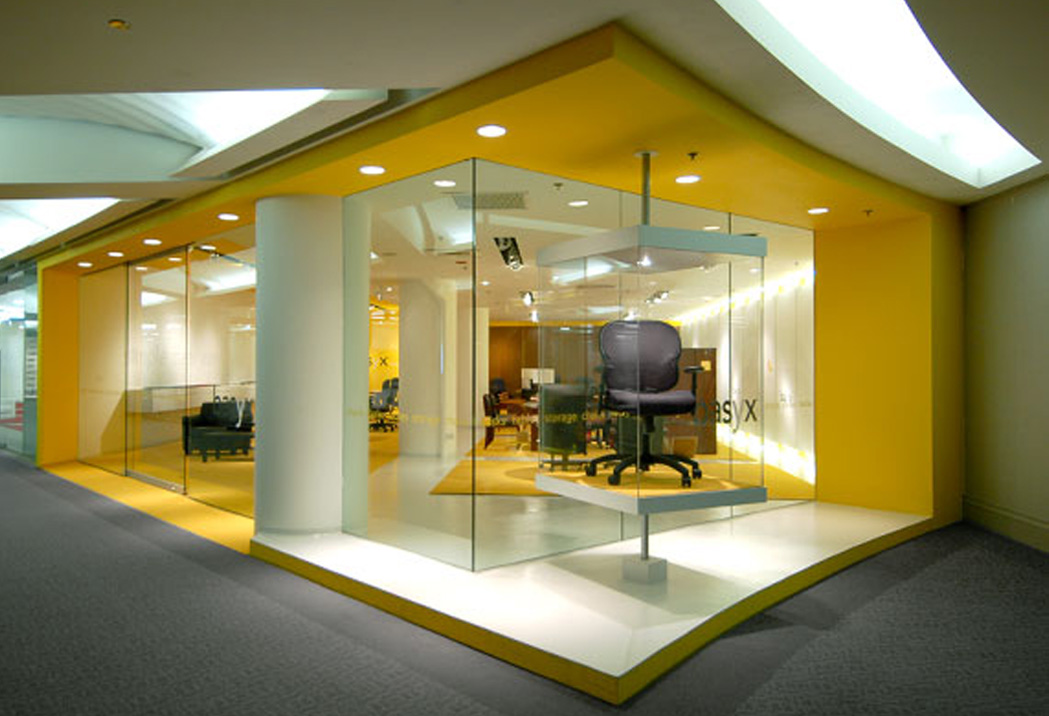
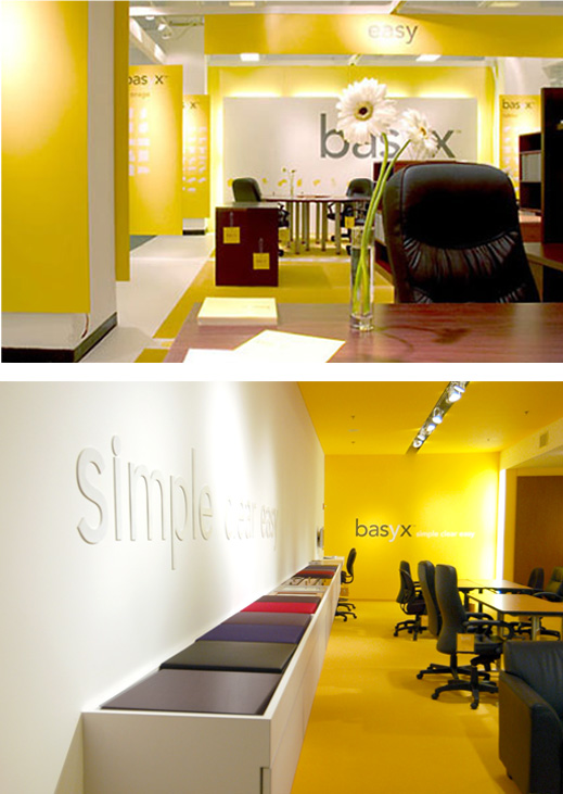
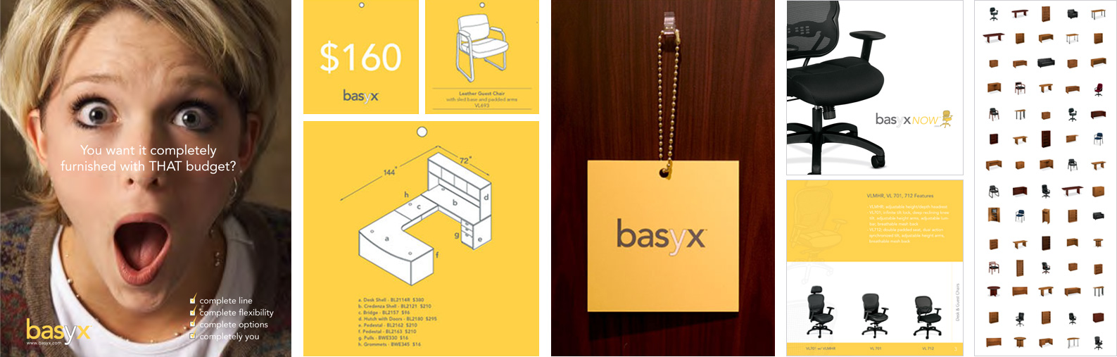
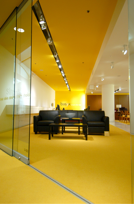
m+ subsequently created and developed all of the baysx brand components, standards, and application templates. This included graphic design, product and brand photography direction/coordination, copywriting, and print coordination for all collateral materials: stationery, promotional mailers, invitations, catalogs, brochures, product update sheets, pricing adjustment labels, and shelf binders. Digital components included a complete website with brand, products, finishes, and a dealer locator, as well as a digital ordering module used to simplify the ordering process. Tradeshows and showroom projects were designed and implemented in Chicago and New York City, including real estate location consulting, interior architecture, design, environmental graphics, construction pricing, project coordination/observation, and planning for event openings.

The basyx brand look and feel is intentionally generic and minimal to reference an entry level cost effective sensibility, position the product in the forefront (product as hero), and to reflect the simplicity and adaptability of the product styling itself. As the product line is developed, the brand strategy, standards, and “simple, clear and easy” templates are utilized by the company for the product development itself as well as all product and information presentations. Secondary brand emphasis continues to reinforce the baysx complete line offering, quick availability, and understated playfulness. This playfulness is a brand thread supported through the use of product icon drawings, copywriting voice and tone, and print advertising.

Chicago showroom

Top to bottom: Trade show exhibit, New York showroom

color

BRAND IDENTITY CONSIDERATIONS

A limited palette of basyx brand colors, yellow, white, and dark gray are utilized consistently throughout the brand applications with the only contrasting tones coming from the product itself in photography and installations. Yellow was selected as the primary brand color for its simplicity, differentiation as a brand color in the contract furniture industry, and ability to coordinate with the laminate and wood tone finishes of the line, highlighting them with a warm and inviting appearance.

logo, typography, fonts

The basyx logo, typography, and icons were developed to support the brand tagline of “simple, clear, easy” and the brand strategy intent. The logo achieves this through use of lower case typography (a sans serif typeface), the dark gray brand color, and one outlined “y” character. The outlined “y” was created to visually connect the logo to the generic brand furniture icon drawings used graphically in basyx presentations and to designate product divisions. The icons bring another level of generic representation and a playful quality to the brand visuals.

photography

The basyx photography will always maintain the product as hero. As a result, the product is always well lit, in focus and visually literal. There are no visually competitive materials in the shots that suggest a particular space, style, or taste. Models are young, hip conservative, and business casual dressed in whites, grays, or cool neutral darks. Models always engage the product, not the viewer. Though product cropping and model positions suggest a work environment, accessories are always kept to a minimum and are only present to support product presentation suggestion of work activities. Photo backdrops are white, gray, and/or shadow only with no distinguished environment. Product images are also cropped to float on solid basyx brand colors in some applications.

copywriting

This minimal, “simple, clear and easy” look and feel is supported through voice, word choice, and tone of all copy, and speaks directly to viewers providing economically constructed descriptions and benefit statements. Copy contains only the amount of information required to make product understanding, specifying, and purchasing as simple as possible.

environments

The basyx environments, both trade show exhibits and showrooms, are three dimensional interpretations of the basyx web, print, and advertising applications. Presentations and product organization within the environments reflect the organization of other basyx identity and informational materials. Graphics and color are expanded into floor, wall, and ceiling finishes as applicable. Support furniture/millwork not produced by basyx is custom fabricated, minimal, and architecturally engages the environment so as to become part of the architectural brand wrapper and not complete with the product.

From left to right: Advertisement, product tags, direct mail brochure, vertical product banner

Chicago showroom

    design team, marquardt+ (work performed as Design Collaboratives)
    + Tom Marquardt
    + Billie Knipfer
    + Mary Beth Rampolla
    + Mandy Sohl
    + Jamie Brizzolara
    + Evelyn Legowiak

    Photography: marquardt+ and Michelle Litvin Photography